What's the difference between Interaction Design and Visual Design (UI)?

Interaction design and visual design are two critical components of user experience (UX) that work hand in hand to create usable, functional, and aesthetically pleasing digital products. While they focus on different aspects of the user experience, both are essential for creating outstanding products that users love.
What is Interaction Design?
Interaction design is a discipline within User Experience that focuses on designing how humans interact with systems, products, processes, or their environment. It's closely related to human-computer interaction, which studies how people interact with technology.
Sometimes, people use the terms User Experience and Interaction Design interchangeably. They are related, but not exactly the same thing, as Interaction Design is referring to a specific aspect of design, wheras User Experience can refer to the end to end holistic experience beyond just the Interactions and User Interface.
"Design is not just what it looks like and feels like. Design is how it works." - Steve Jobs
The Critical Role of Context and Functionality in Interaction Design
Let's take streaming video as an example of digital product design. While the user interface might seem simple - a series of card patterns organized into rows - there's much more to consider:
- How users interact with their content in different states
- The context of use (e.g., on a couch with a 10-foot UI or on a mobile phone)
- Designing behavior and functionality that supports the watching experience
- Planning how different devices interact (e.g., mobile app with TV)
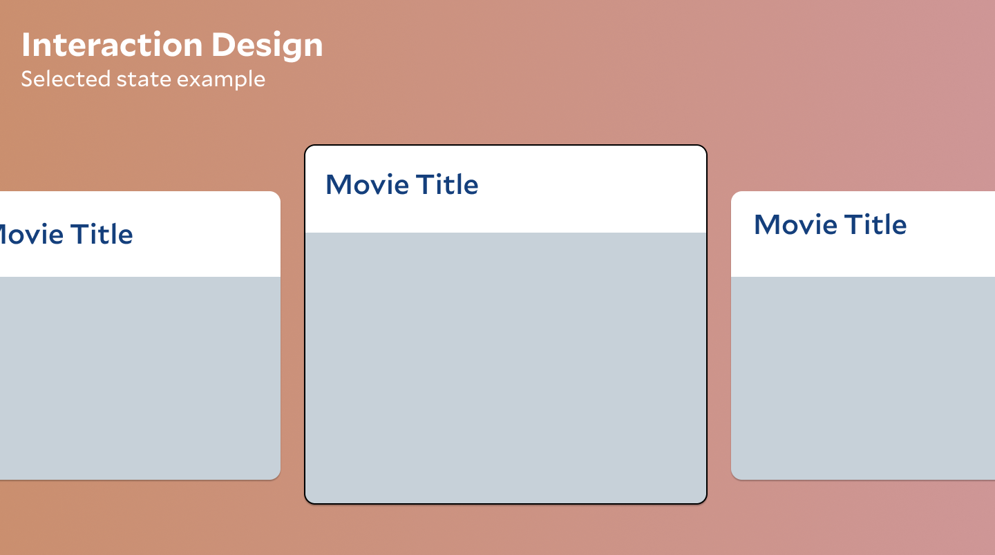
Even simple interactions, like how a selected state is displayed, fall under the purview of interaction design. This includes designing the behavior and functionality that supports the watching experience—for example, planning how the mobile app interacts with the TV.
A simple example of interaction design at work is how the selected state is displayed. This might be card tiles enlarging slightly to show a border when the user chooses a show.

Microinteractions and Animations for Interaction
Interactivity is at the system level but also existss of the user experience, including progress bars in other aspect or loading states. One of the primary functions of microinteractions is to communicate the system's current status to the user.
For instance, when a user submits a form, a brief animation indicating that their submission is being processed eliminates uncertainty. This real-time feedback reassures users that their action is recognized, enhancing their trust in the system. According to the Nielsen Norman Group, effective micro interactions convey system status succinctly and efficiently.
In this example from Airbnb, a few different animated states contribute to an overall polished feel. However, the animations draw attention to important details while giving you the perception that the load time was nearly immediate.
Airbnb example of animation and micro interactions
Why Interaction Design and System Design Create Seamless User Experiences
Interaction design goes beyond the surface level to shape the underlying systems and system flow. For example, in a streaming platform, designers craft:
- Personalization features
- Recommendation systems
- Discovery mechanisms
This system thinking approach to design involves understanding how all interrelated parts connect to create a cohesive user experience.
Every action a user takes in a digital product or system requires a reaction. Designing these reactions is crucial for usability. The usability heuristic "Visibility of System Status" addresses the need for system feedback as an essential component of a usable experience.
While engineers implement and develop the system’s functionality, designers craft the system’s shape by understanding the user’s journey and defining the content the user might want to see and when. This layer of interaction design is sometimes called a system thinking approach to design to understand how interrelated parts connect for a user experience. (Not to be confused with design systems)
Those system reactions are not automatic; either someone designs how the system responds, or the system doesn’t respond, and the heuristic principle is violated.
How Information Architecture Simplifies User Interaction
Interaction design leverages use cases and scenarios to shape user interfaces from functional and behavioral perspectives. It's concerned with:
- How views will be accessed
- How information will be organized
- Workflow design to help users accomplish their goals
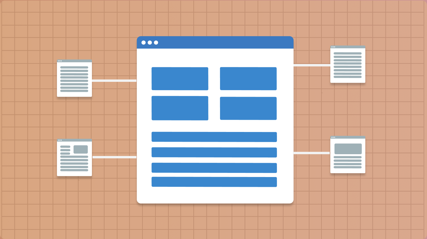
Navigation and wayfinding are integral aspects of interaction design, guiding users through different pages to find the information they need. Search, navigation menus, and content organization all facilitate information discovery.
The information architecture must match the user’s mental model of how information maps together. How users interact with the categories and content is both a content design and interaction design problem.

The Role of Visual Design in the User Interface
Visual design focuses on the visual language at the interface level, using the foundations of:
- Color
- Typography
- Iconography
- Illustration
- Other style elements to craft brand-related attributes
Visual design is essential to the entire user experience in enhancing usability and product desirability. Visual design relies on visual language attributes to communicate and guid users through layouts to enhance use of the product.
As a part of creating a usable experience, these three critical aspects of visual design aid in the usability of the user interface:
- Representing relationships and hierarchy of information
- Affordance of behavior
- Consistency
Information Hierarchy, Affordance, And Consistency In Usability
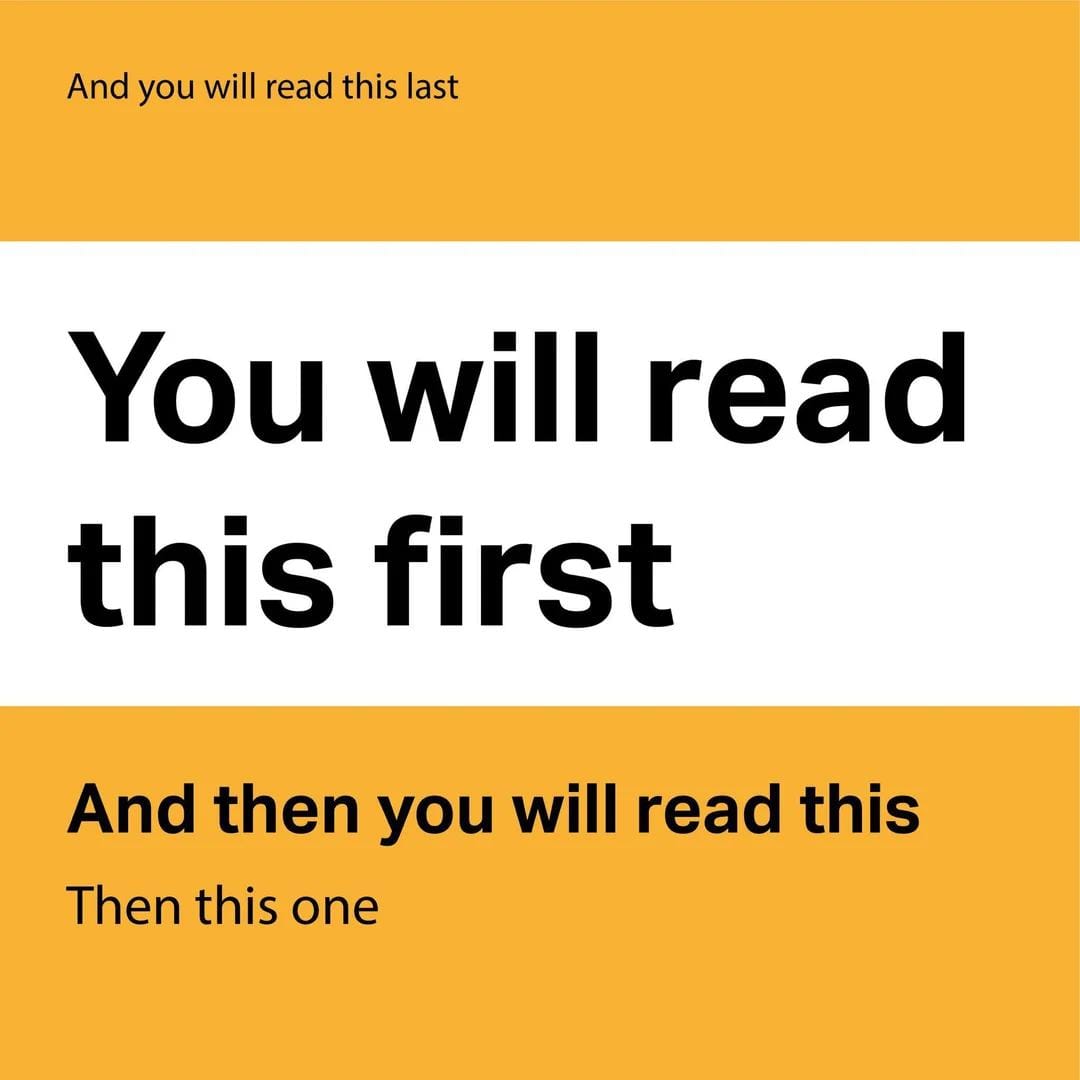
Hierarchy communicates the essential information on the page through design. If most people want to see a specific type of information, the information hierarchy shows that information at the top, with less critical information at the bottom.
The correct information hierarchy ensures that your experience is usable in terms of finding information and supporting whatever task the user is trying to accomplish. Headings and typography help to communicate and establish an information hierarchy.

Affordance, as it relates to visual design, is the visual cue informing the user how to use something. In digital product design, this can be visual details like a drop shadow to show elevation or a textured icon to show that something can be dragged, like on an iOS sheet.
Consistency contributes to ensuring the experience is usable. One of the heuristic principles is Consistency and standards. Using consistent elements sets user expectations of what something will do.
As a result, visual design ensures everything follows the same style and behavior.
Harnessing Design Systems For Consistent Interactions and Visual Design
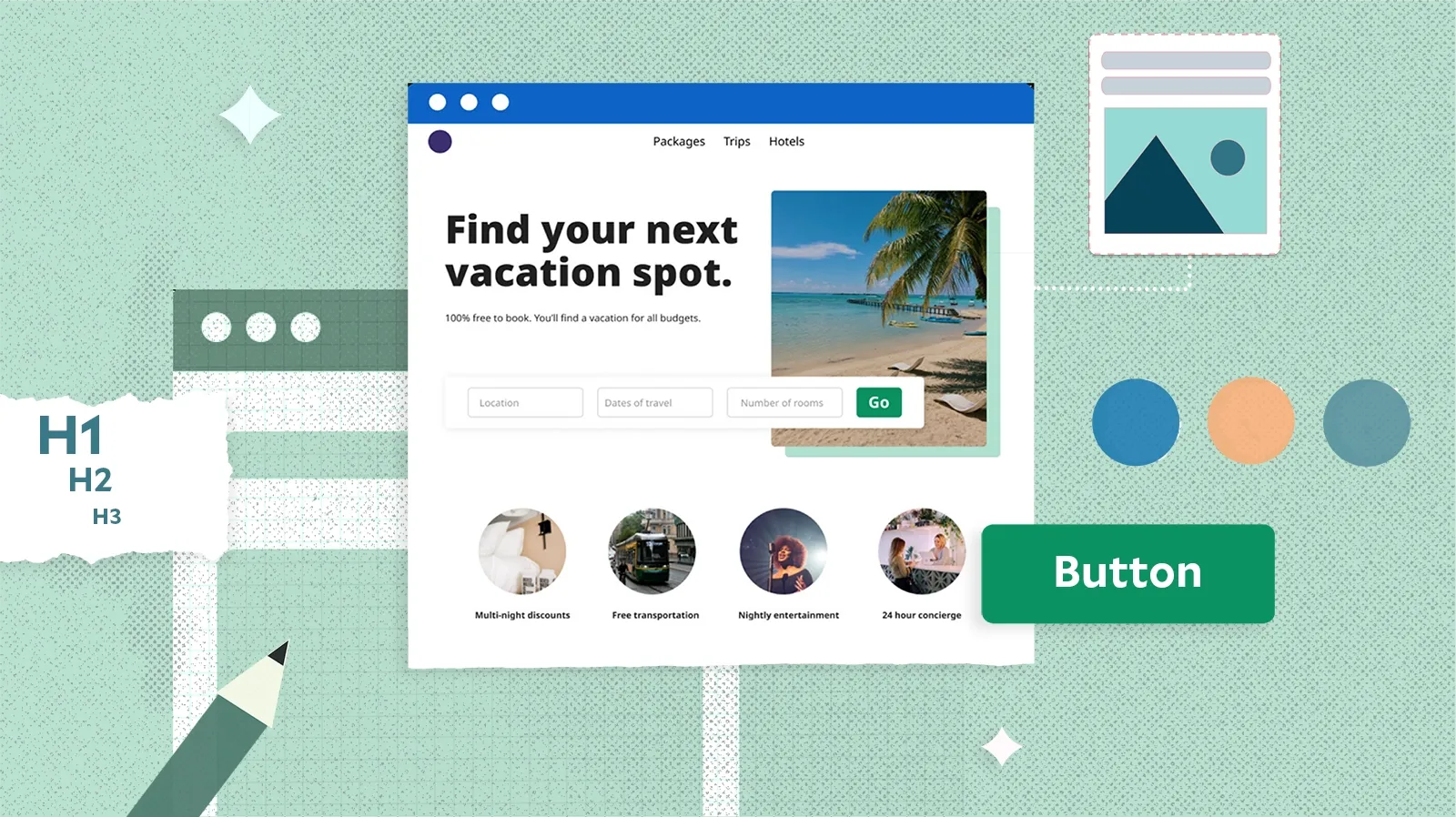
The design system is a set of user interface visual elements and components used in the design. Typically, the color and typographical features are baked into the design system.
Design systems comprise base-level components like buttons and text entry fields. If these components are created with code, the interaction states associated with them, such as hover states.
Design systems intersect between visual and interaction design on a component level. In most companies, the design system team creates components based on best practices in usability and accessibility.
In addition, the visual design is already part of the component, so it accurately reflects the aesthetics and usability of the product.
The Importance of Interaction and Visual Design in Product Experiences
Now and again, I’ll find people arguing online (Hello, Reddit!) about which skill is more critical.
The truth is that both are needed for a good user experience.
I’ve seen powerful interaction design-based experiences that functionally made sense and improved over the previous design but were hard to look at and understand from just the visual design alone.
User feedback for that product design was, “It’s much easier than the other experience, but I still prefer the other one because it doesn’t overwhelm me.” I’ve also seen the opposite, where the design is beautiful but could be more usable and well thought out from the system perspective.
Aesthetically driven designs without consideration of robust interaction design can lead to many rabbit holes or missing features. A common misconception for design is that minimal interfaces are better. It depends on the context; if you hide important information in favor of minimalism, users won’t be able to accomplish their tasks.
Context is everything in design; visual and interaction design are needed to create functional experiences.
In conclusion
Interaction and visual design are required for usable, functional, and aesthetic experiences.
References
https://www.usability.gov/how-to-and-tools/methods/heuristic-evaluation.html
https://www.usability.gov/what-and-why/usability-evaluation.html
